The Kiosk Revolution: What, Why, and How
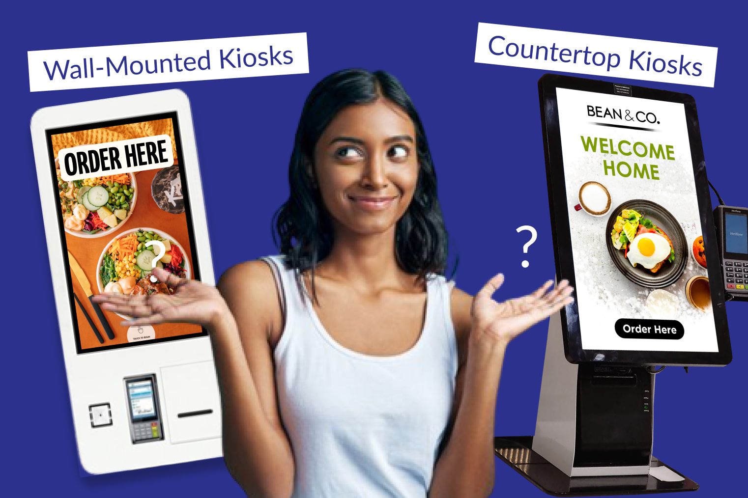
What is a Self-Ordering Kiosk?
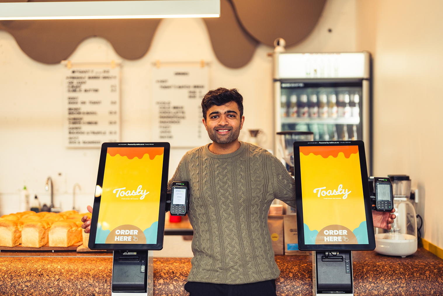
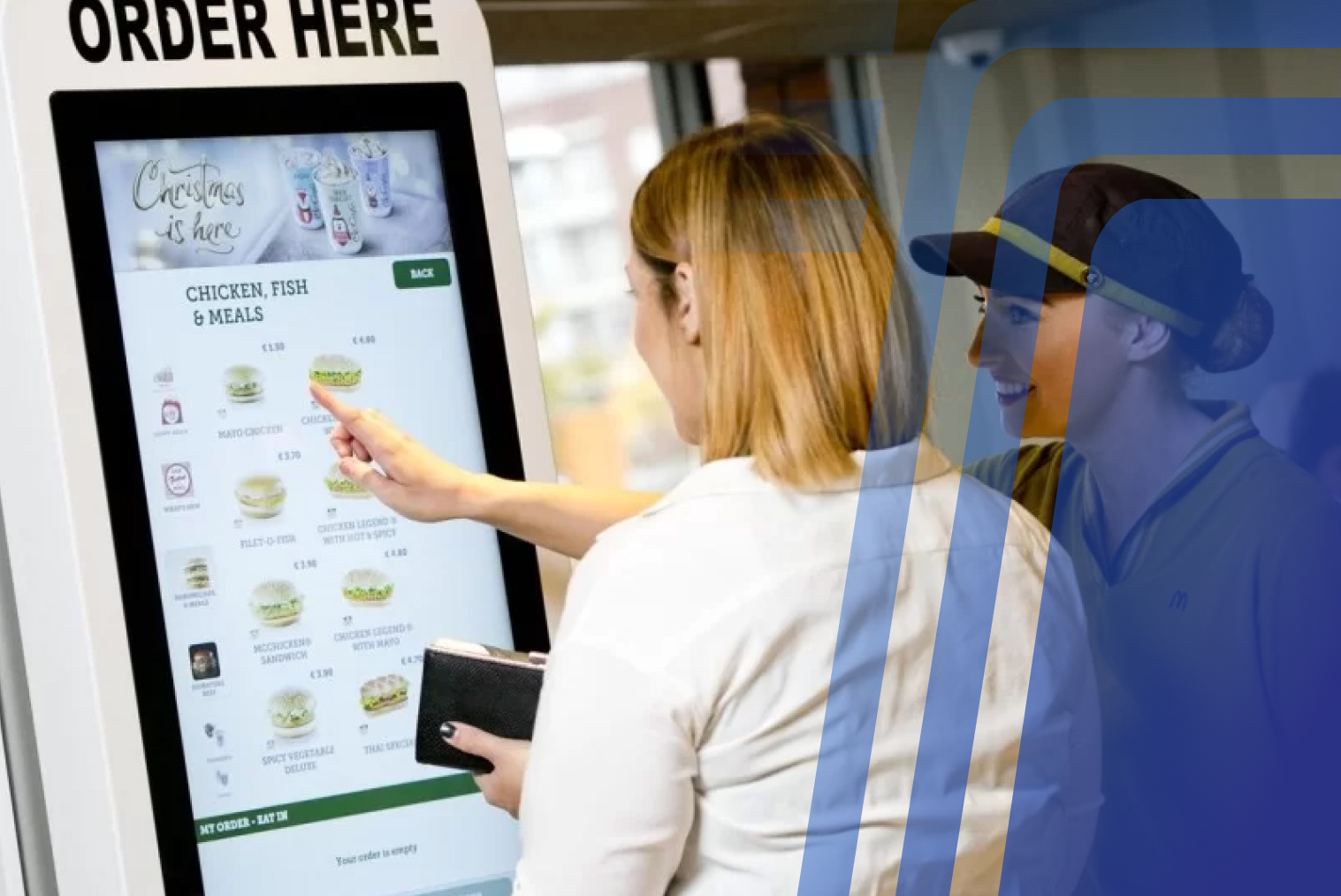
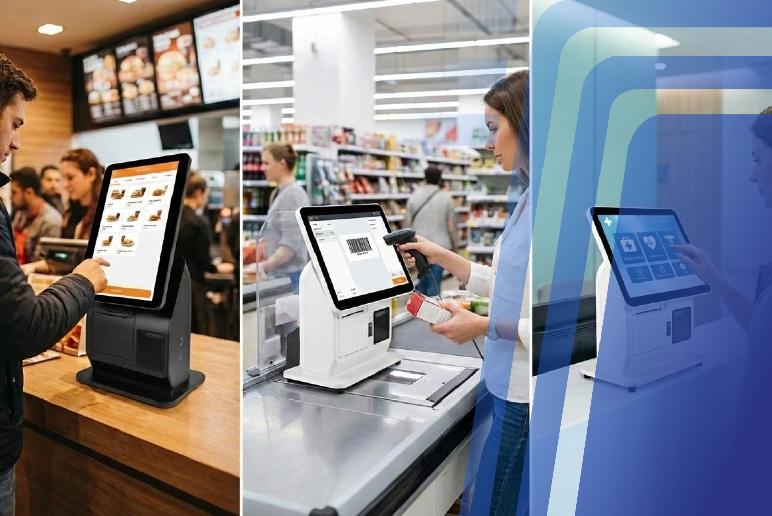
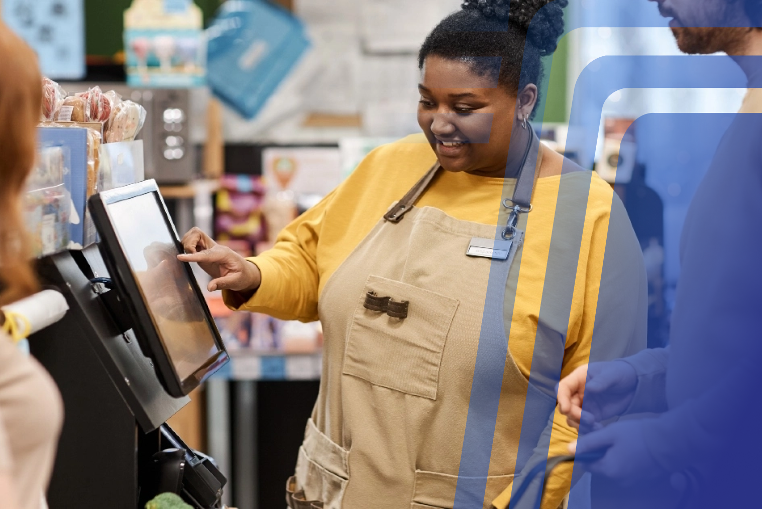
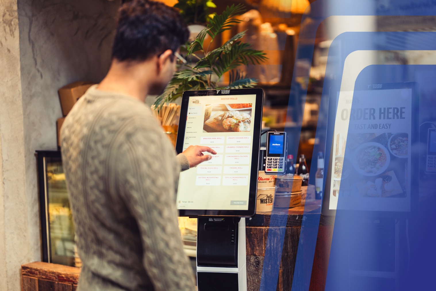
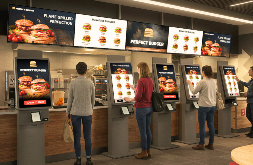
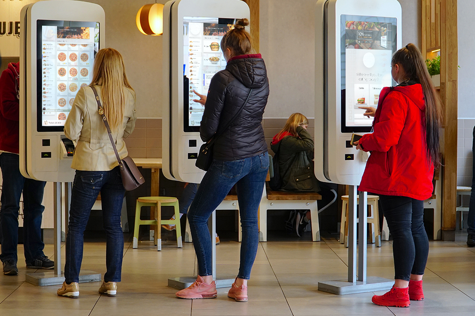
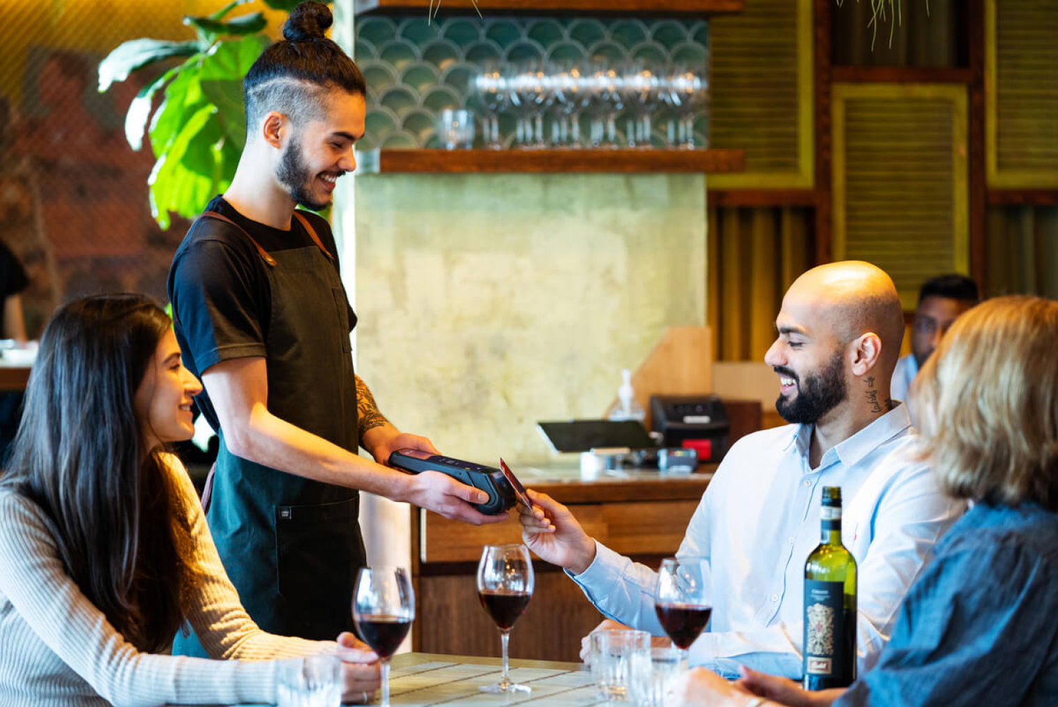
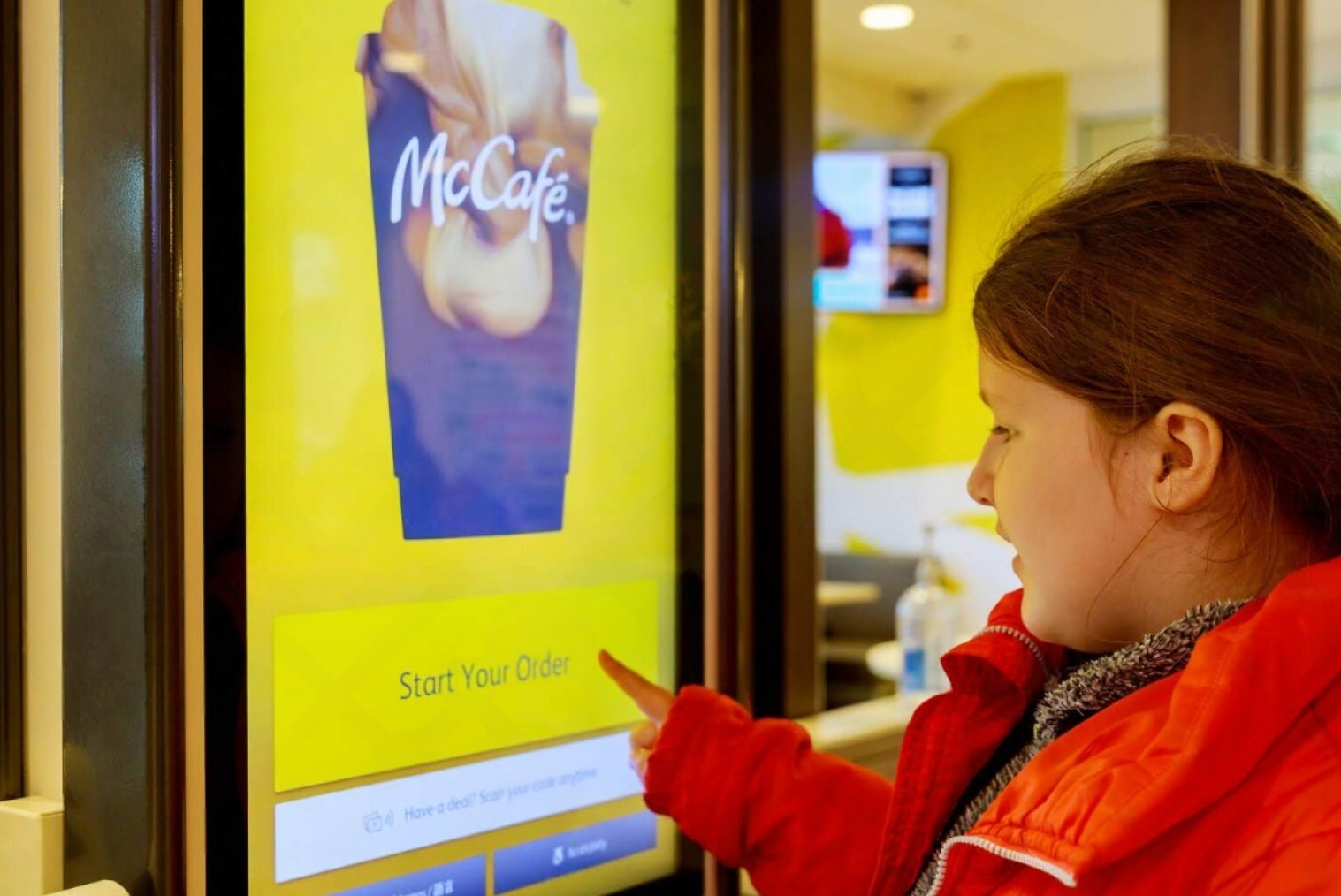
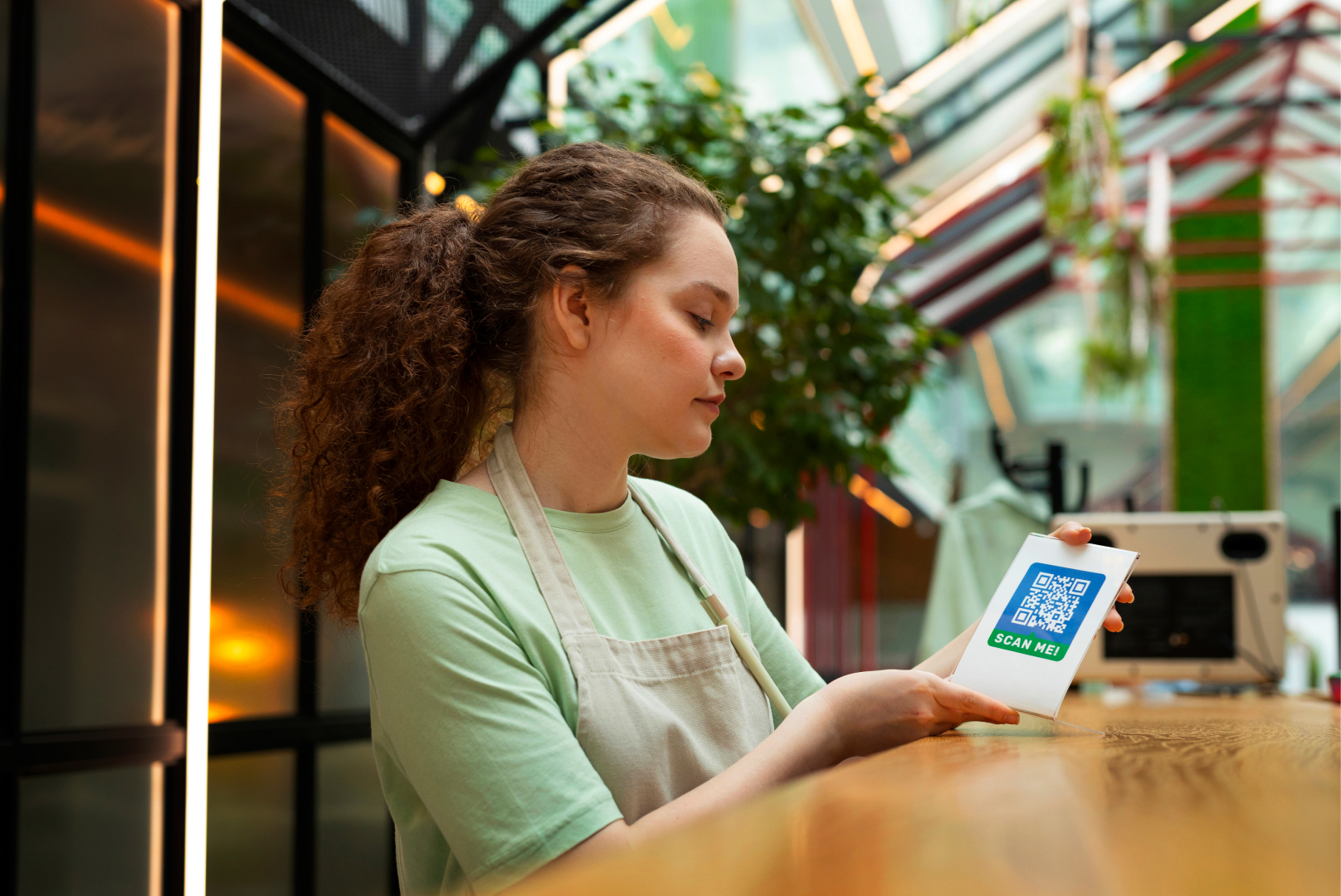
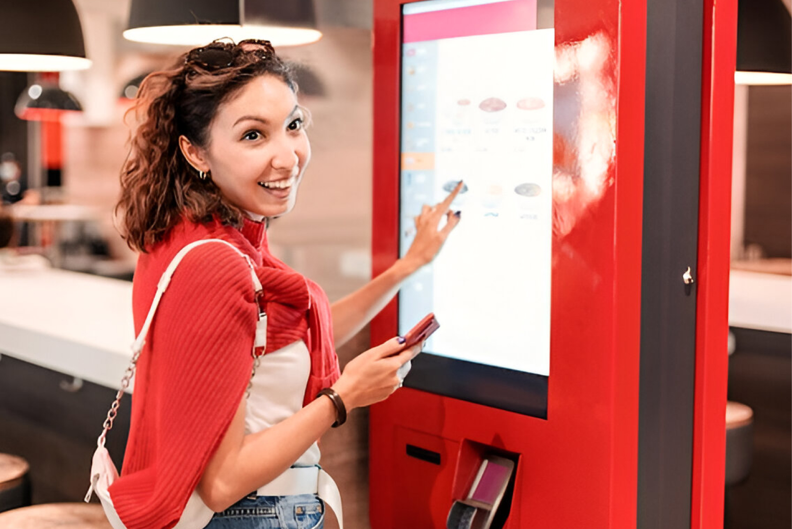
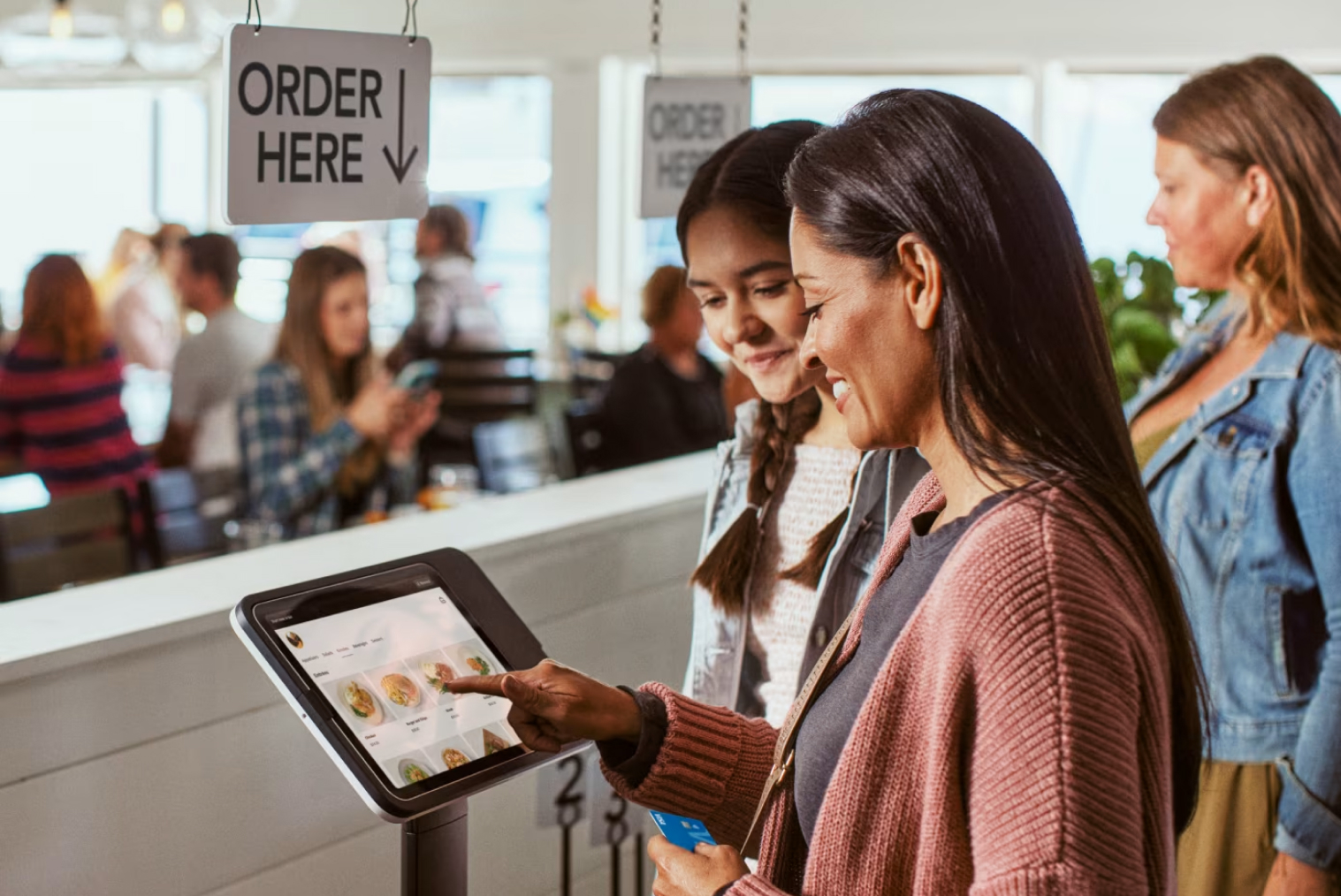
The self-ordering kiosk is an independent digital interface where customers can peruse the menus on offer at your restaurant, order custom-made meals, and pay for their orders, all without the help of the cashier.
Why Optimize Your Menu?
It’s a common misconception that simply having a screen will boost revenue. The reality is that a cluttered or confusing interface can frustrate customers and lead to line abandonment. You need to optimize menu for kiosk ordering to ensure the system serves as a helpful, intuitive guide rather than a digital roadblock.
How Kiosk Layouts Impact Sales
A well-structured restaurant kiosk menu layout acts as your best, most consistent salesperson. By using visual hierarchy, you can draw the customer's eye to high-margin signature items and prompt strategic, zero-pressure upsells at the exact moment they are most receptive to them.
Self Ordering Kiosk Menu Optimization: Key Strategies
It is crucial to have an understanding of the psychological factors behind the purchase behavior of customers before delving into the process of creating digital designs. People tend to analyze visual stimuli much faster than textual information, and when they are exposed to too many choices at once, it results in decision fatigue.
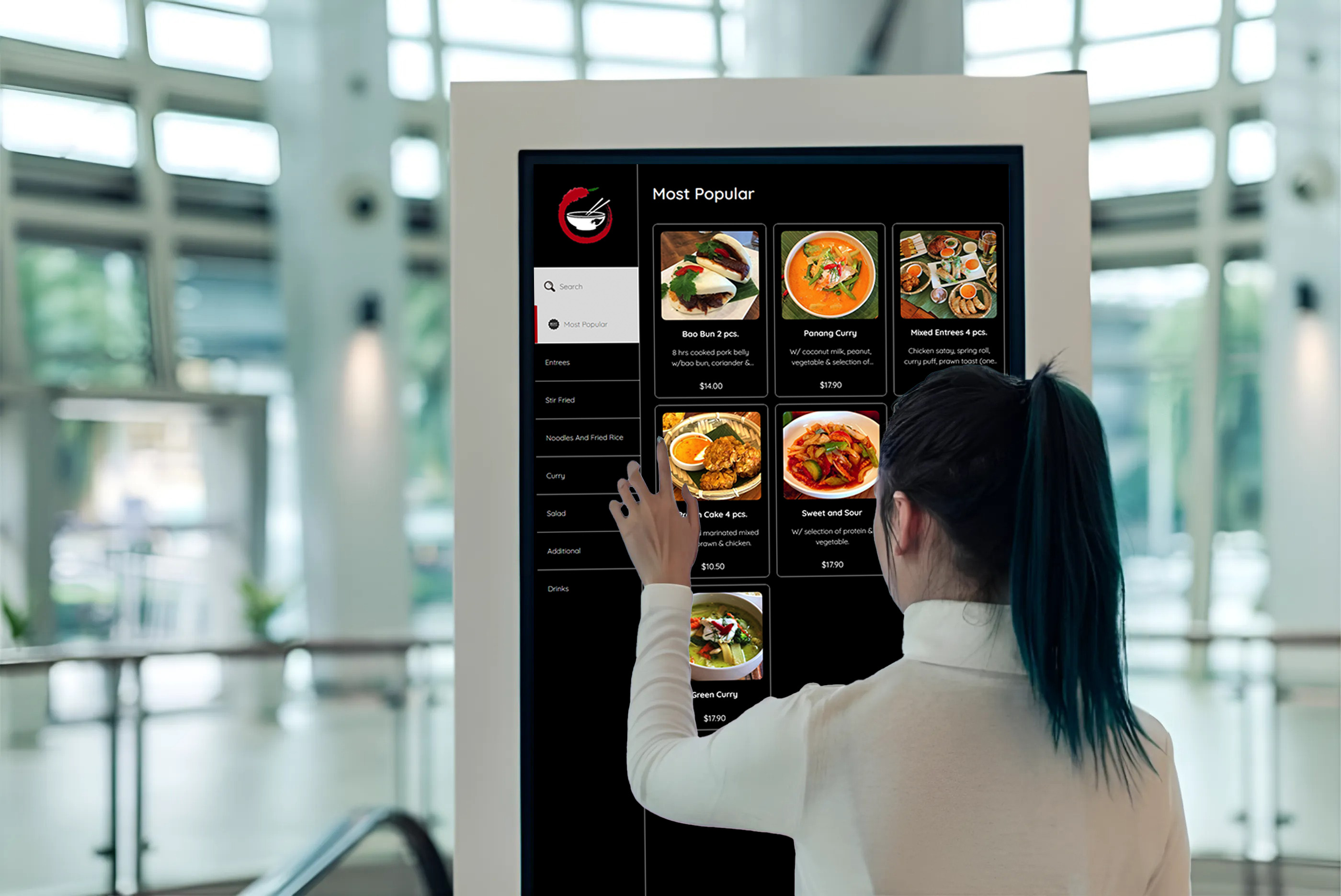
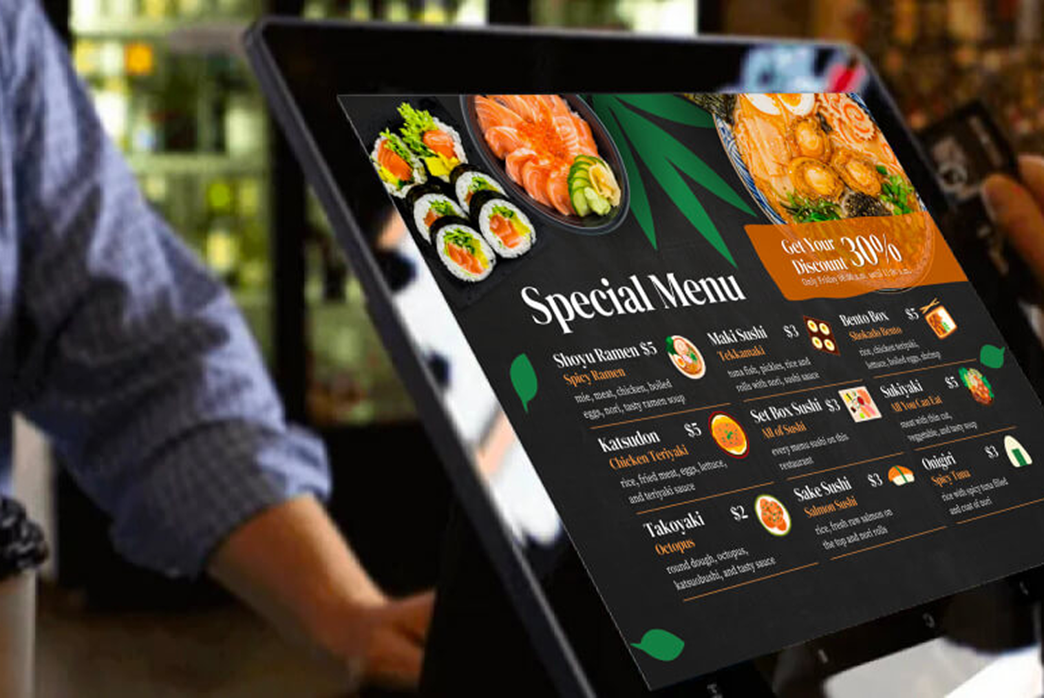
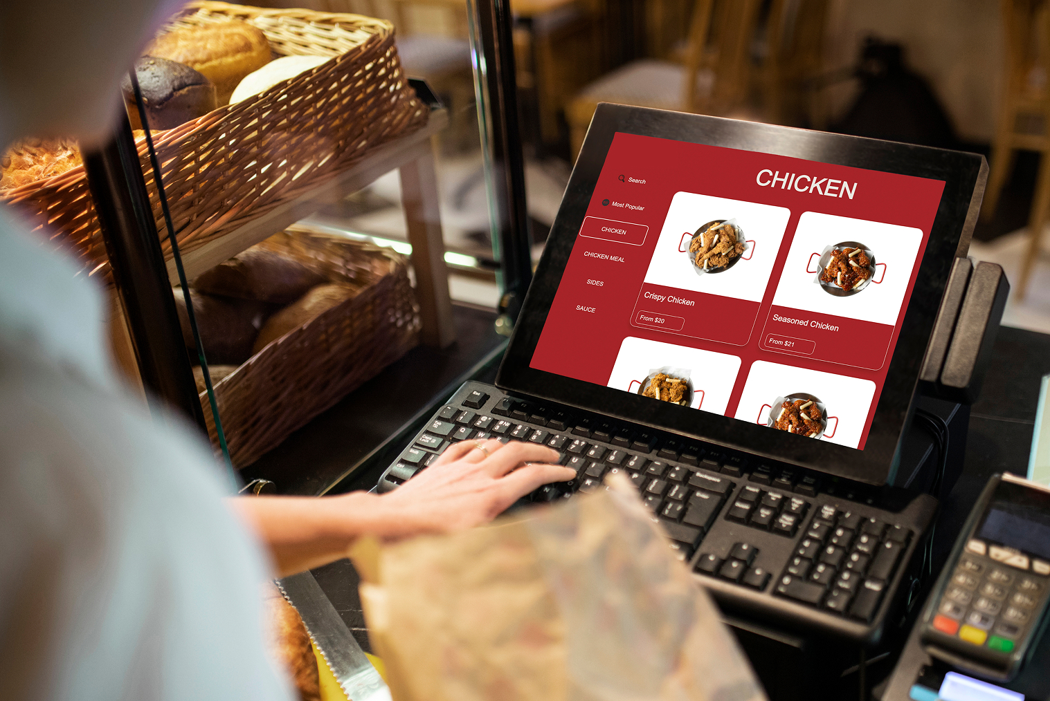
- Lead with Mouth-Watering Visuals: We eat with our eyes first! Every primary menu item should feature a high-resolution, appetizing photo. According to Industry Report, self-service kiosks can increase average order value by 10% to 30%, primarily due to visual upselling, guided modifiers, and customers taking more time to browse menu options. The study highlights that customers ordering through kiosks are more likely to add extras compared to counter ordering. reporting a 20-30% lift in check sizes, including 20% at Taco Bell and approximately 30% at McDonald's.
- Simplify the Navigation: Your restaurant kiosk UI design must be logically structured. Group items into broad, clear categories (e.g., "Combos," "Shareables," "Drinks") and use a sticky navigation menu so users can easily toggle between sections without having to scroll endlessly.
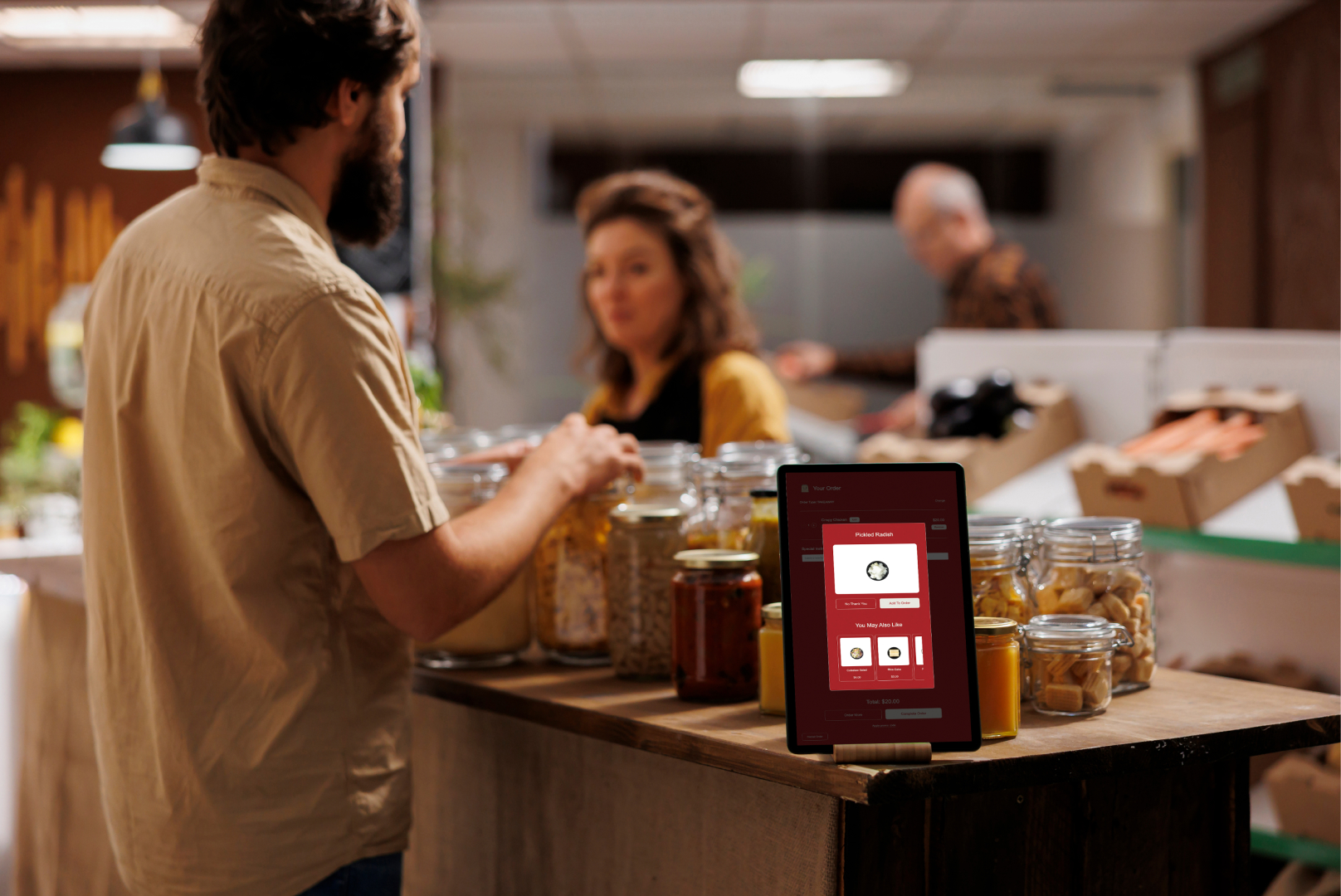
- Be Strategic with Upsells: Don't annoy your guests with pop-ups after every click. Instead, suggest complementary items seamlessly within the workflow—like prompting them to add guacamole when they build a burrito or offering a discounted cookie right before checkout.
Good vs Bad Kiosk Menu Design
- A well-optimized kiosk menu improves ordering speed and increases conversions, while a poorly designed layout can slow down queues and reduce upsell opportunities. The difference often comes down to clarity, visual hierarchy, and how smoothly customers can navigate the menu.
- The table below highlights good vs bad kiosk menu design practices for effective self ordering kiosk menu optimization.
| Good Kiosk Menu Design |
Bad Kiosk Menu Design |
| High-quality food images for key items |
No images or low-quality visuals |
| 5–8 clear menu categories |
Too many confusing categories |
| Best sellers highlighted at top |
No featured items |
| Logical flow from category → item → checkout |
Random navigation structure |
| Limited, meaningful customization |
Too many modifier steps |
| Clear combo and upsell suggestions |
Aggressive pop-ups after every click |
| 6–8 items per screen |
Overcrowded screens |
| Sticky navigation or easy back option |
Hard-to-navigate menu |
| Consistent layout across screens |
Different layouts on each screen |
| Fast checkout with minimal steps |
Long multi-step checkout process |
- Designing menus using these kiosk menu design best practices helps reduce decision time, improve ordering speed, and increase average order value. A clean restaurant kiosk UI design ensures customers move smoothly from browsing to checkout without confusion.
Kiosk Menu Design Best Practices to Avoid Line Abandonment
To maximize the return on your hardware investment and keep your queues moving, follow these kiosk menu design best practices:
- Limit Options per Screen: Prevent cognitive overload by displaying only 6 to 8 primary items per screen. Use clean grids and ample white space.
- Make Your Call-to-Action (CTA) Pop: Your "Add to Order," "Checkout," and "Pay Now" buttons should be large, brightly colored, and impossible to miss.
- Design for Accessibility: Ensure your text is legible, fonts are bold, and colors contrast well. Also, ensure the interactive elements on the screen can be easily reached by guests of all heights, as well as those in wheelchairs.
Match the Software with the Hardware: A beautifully designed menu needs responsive, lag-free hardware to shine. Whether you are searching for a reliable kiosk nz supplier or you are generally selecting the right kiosk setup for a global chain, choose screens that are highly responsive to touch.
Frequently Asked Questions (FAQs)
Q1. Can menu personalization improve kiosk sales?
Yes! Personalization, such as recognizing a returning customer via a loyalty login and suggesting their "usual" order, makes the process incredibly fast. It also allows the system to recommend highly targeted add-ons, which naturally drives up the final ticket size.
Q2. What menu mistakes slow down kiosk queues?
Cluttered screens, missing product images, tiny text, and forcing customers through too many mandatory customization screens are the primary culprits. If a guest has to tap their screen ten times just to order a plain cheeseburger, your line will inevitably back up.
Q3. Do images increase conversions in kiosk ordering?
Absolutely. High-quality images remove the guesswork from ordering and trigger immediate cravings. Customers are significantly more likely to impulse-buy sides and desserts when they can see exactly how delicious they look.
Q4. How many menu items should be shown on a kiosk screen?
To prevent decision fatigue, it is best practice to display between 6 to 8 primary items per screen. You can organize the rest of your offerings into clear, easily tappable categories so the screen remains uncluttered and easy to digest.


.png)


.webp)